Brady Industries
Aiming to create a sleeker user experience while keeping brand identity
Role
UX Designer Intern
Project
Website Redesign
Timeline
1.5 Months
Tools
Sketch, Illustrator
Background
Brady Industries is one of North America's leading distributors, offering specialized support to a diverse customer base. With 180 locations across the United States and a team of over 1,500 sales professionals, they serve key sectors such as education, healthcare, and restaurants, delivering tailored solutions to meet their unique needs..
Summary
For this project, I was tasked with redesigning a product website that lacked key information and usability. I focused on improving the site's structure, providing users with the details they needed, and creating a consistent, intuitive experience. The redesign aimed to make the site more user-friendly and accessible, addressing gaps that hindered engagement and understanding.
Problem
The website struggles to engage users because it lacks clear navigation and fails to effectively communicate the value and benefits of its products.
Process
Understanding the Market
Brady Industries is a very large distributor meaning they have a huge catalog of products with varying features. How information is presented on the site differs between those with accounts and those without. Brady prioritized personalized customer support including web ordering, spend management, and equipment repair
I did comparative analysis to understand best practices in distribution, ensuring the redesign aligned with Brady's values and goals. This included researching competitors such as WCP Solutions and Steller Industrial.
Insights
✧ Ease of Access - As website users are often sales representatives from a variety of industries, an intuitive, accessible design is necessary. Users need to find the products they need on time, regardless of their technical experience.
✧ Gaps in what competitors offer - Brady can stand out by highlighting its personalized service model. Especially the availability of a dedicated sales representative for customer support - a feature competitors lack
✧ Legacy and Growth - Insights into Brady’s history show they are a long-established company with a good reputation in distribution.
Navigation Sitemap
Before developing the low-fidelity wireframes, I created a straightforward sitemap outlining the website's core content. This step gave me a clearer understanding of the redesign's structure and direction.

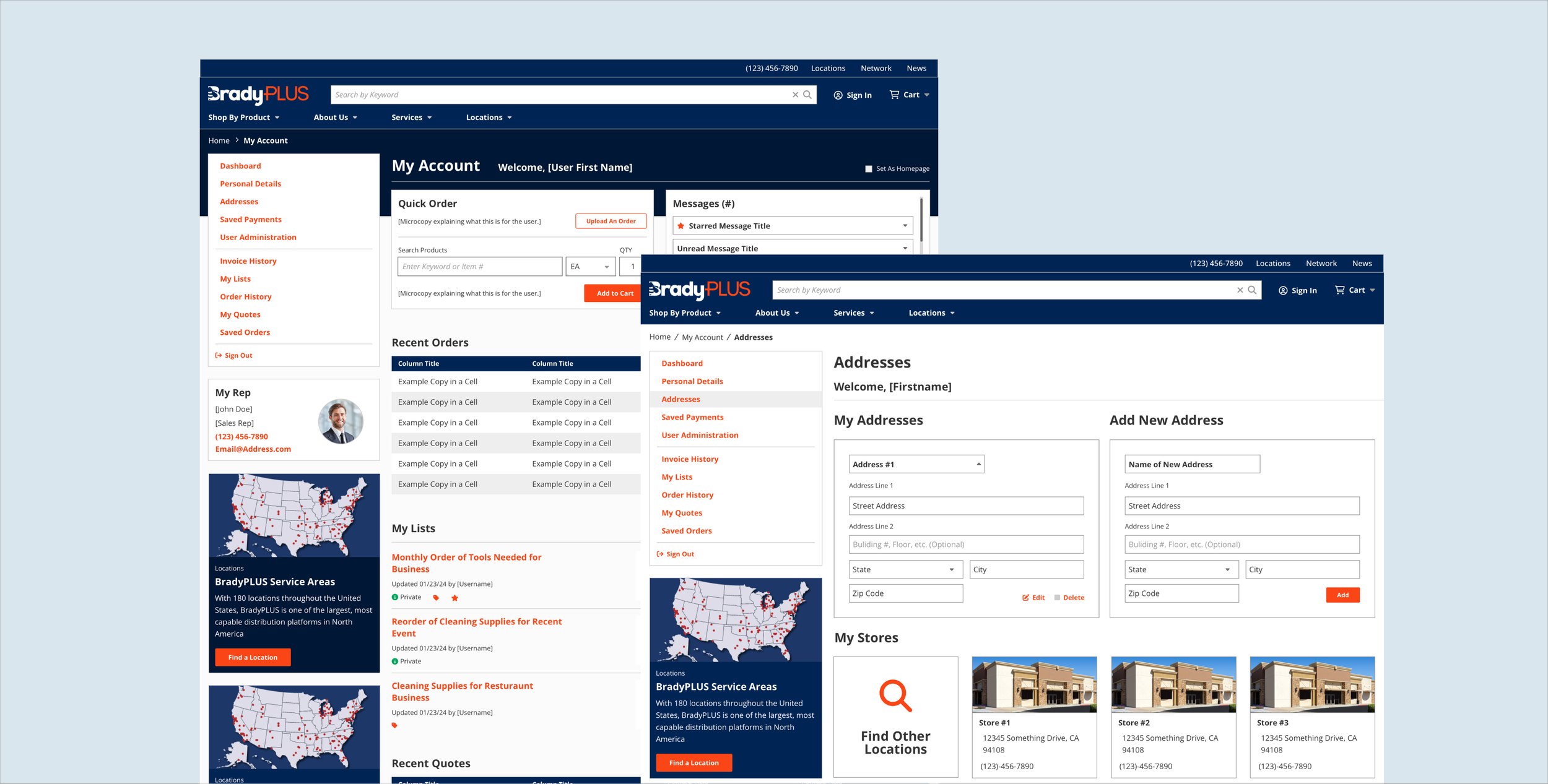
Image above shows user’s my account page and saved address list of account page on new Brady
Design Process
After conducting extensive research and gathering insights I began to create low-fidelity wireframes. These designs served as the foundation for various design solutions.
Low Fidelity
Design Changes
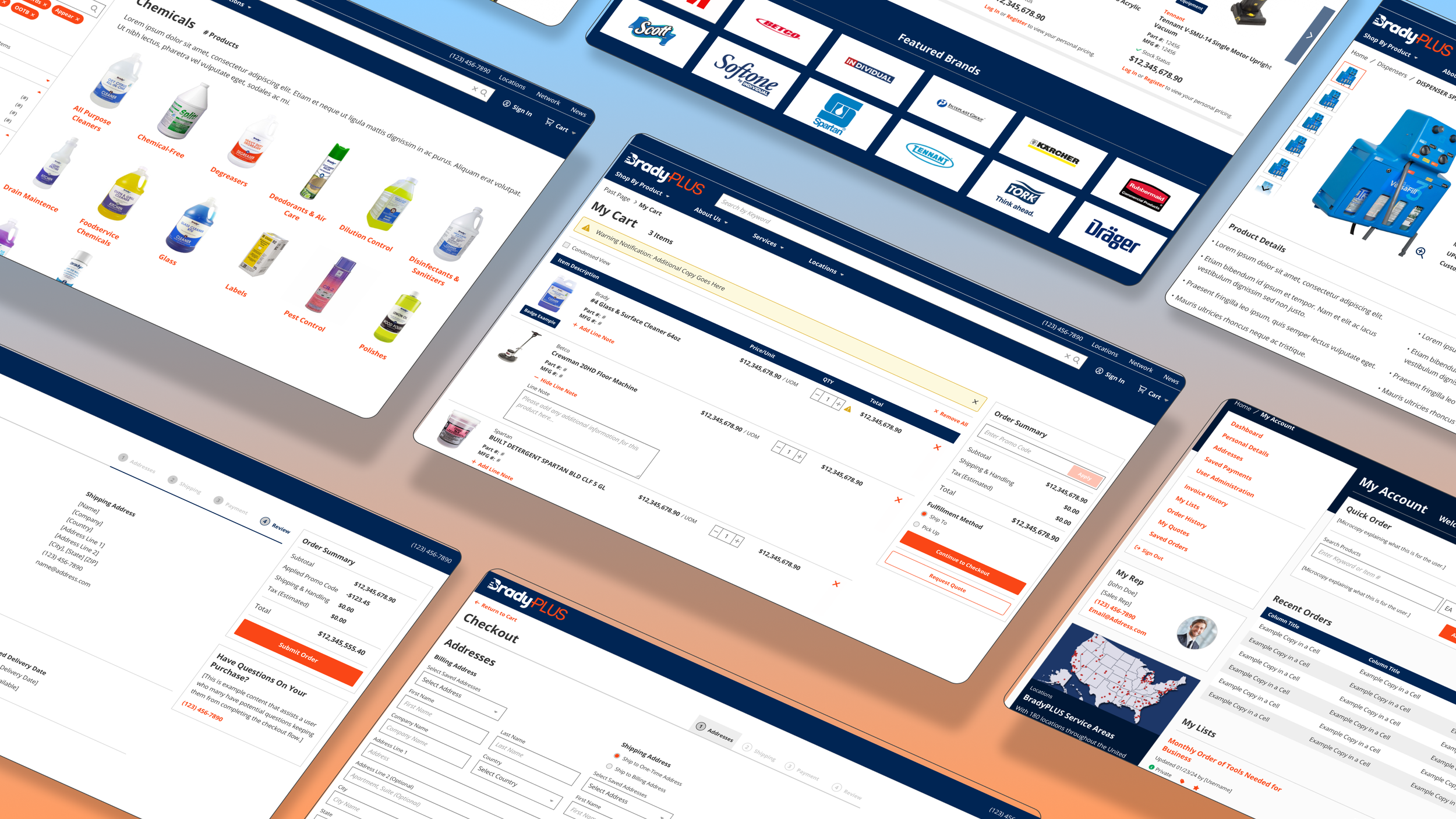
Post the creation of various low-fidelity wireframes I proceeded to develop high-fidelity wireframes. I refined the functionality and enhanced the presentation of information on the site. My primary objective was to achieve a cleaner, more polished appearance, eliminating the unnecessary empty spaces in the previous version. I incorporated the same colors and many of the same visuals. One major adjustment was the header and the footer of the new site
Homepage
✧ Greater Contrast Between Elements: improvement of visual hierarchy and balance making sure key information stands out more
✧ Inclusion of More Customizable Sections: allows for motion to have more flexibility when adding content and and promoting key messages
Product Listing Page
✧ Introduced Search by keyword field in PLP as well as filters to help find content faster
✧ Allowed for short call out description at top of page to allow Brady to use it for promotional material
Product Display Page
✧ Displays key product details: product, manufacturer numbers, and toggleable views are included for easier access to all information simultaneously
✧ Incorporated user review section: users can now add reviews, to enhance user decision-making and overall experience
✧ Enables users to add items to cart without requiring an account
Checkout List Feature
✧ Enhanced the checkout process: integrated a "saved lists" feature, enabling users to manage lists and add them to cart without leaving the checkout page.
✧ This addition was shown to my supervisor and was later added to other websites the company was working with
High Fidelity Designs
Reflection
If I could have approached this project again I would have liked to ultimately conduct more user interviews and have a longer brainstorming and design process.
1. Give users the information they need
While working on the redesign, I noticed the original site left out a lot of key details. Even as someone outside the target audience, I found myself confused about the products and what they offered. It made me realize how important it is to give users all the info they need upfront so they feel confident navigating the site.
2. Skill development led to fast learning
With only about a month and a half to wireframe and redesign the site, I had to get better at making quick decisions and standing by them. I learned to trust my instincts while always having solid reasons for my design choices. This whole experience helped me grow and improve my design process overall.
3. Use of existing UI can improve aspects of the site you may not always think of
I found that sticking to consistent UI elements made the site a lot easier to use. Adding different designs for things that served the same purpose just made the site more confusing.


