Motion Industries
Redesign for more impact, with a focus on intuitive navigation and more calls to action
Role
UX Designer Intern
Project
Website Redesign
Timeline
1 Month
Tools
Sketch, Illustrator
Background
Motion Industries is a leader in industrial solutions specifically in the MRO (maintenance, repair, and operating) and OEM (original equipment manufacturer) markets. They serve a variety of industries such as automotive, oil and gas, and manufacturing. The company serves over 200,000 customers worldwide through a extensive distribution network.
Summary
For this project, I was assigned to redesign a competitor’s website as a way to evaluate how I could enhance user experience. I was to analyze it through the lens of a typical user, such as plumber, to uncover areas of improvment
Problem
The current website lacks intuitive navigation and sufficient information, making it difficult for users to find what they need. The challenge is to redesign the site to improve user flow and provide additional content while ensuring that the enhancements do not overwhelm users or complicate the overall experience
Research
Insights on Industry
The current Motion site does have the information that its B2B customers need but a modernization in design could help with usability. The site navigation and layout could be more intuitive and allow easier access for users from various industries.
Granger and other similar industrial parts distributors offer simple websites but often lack engaging features. Motions redesign will focus on creating a more intuitive user experience with features enticing customers to continue to shop on the site for longer.
Introducing a more in-depth PLP filter menu, to allow users to have a larger amount of filters without taking up too much space
Goals
✧ Overview -Motion serves a wide range of industries, a new website should engage all customers and bring in new ones as well.
✧ Target Market - As a B2B company, its primary customers include procurement managers, technicians, and engineers who prioritize reliability and service. The website needs to be intuitive enough for a wide range of users
✧ Branding - Motion has expertise in advanced automation, engineering capabilities, and global reach positions it as a trusted industrial partner

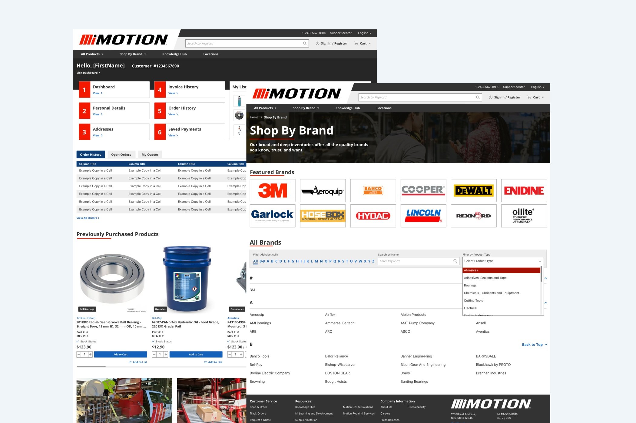
Image above shows authenticated homepage and brand listing page of new Motion website
Objectives
Before beginning the design process I made a list of both needs the motion company would need in a new design as well as user needs, finding some main points of commonality that I would focus on heavily.
Keeping these in mind I was able to focus on the overall sites look and what I would like it to convey to both users and motion. I wanted to enhance these characteristics and make sure they play a central role in the design process
Design Process
Before and After Designs
After understanding the Motion brand, and goals for the new website, I began to focus on areas of the site I deemed needed to be improved. This included providing more information for customers through clear website navigation.
After creating low-fidelity wireframes I focused on the high-fidelity versions. Here I tailored the new site to fit with the brand identity while being more intuitive.
A portion of the site that I made sure to adjust throughout was the header and footer, I felt as though the previous sit had far too large of a header with a lot of unnecessary space and I felt as though the space could be better utilized
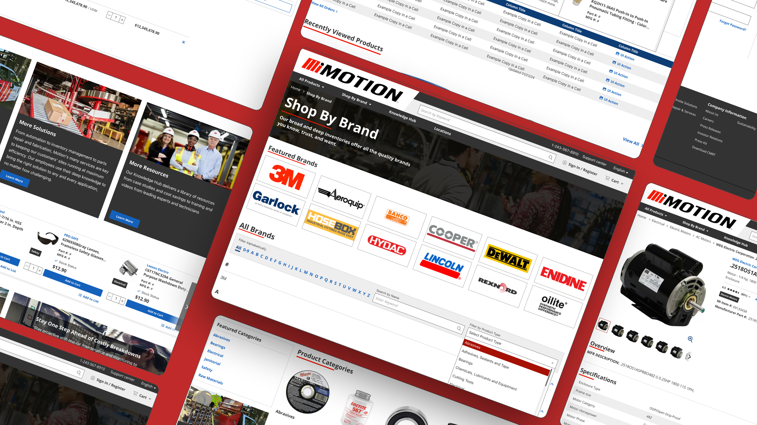
Brand Listing Page (PLP for Brands)
✧ Reorganized product categorization: Removed the sidebar with multiple product types and replaced it with a streamlined dropdown menu, making the brand selection process more intuitive and less cluttered.
✧ Enhanced brand visibility: Added a "Featured Brands" section to highlight brands that Motion is most closely aligned with, promoting these key partnerships and their products.
✧ Improved search functionality: Introduced a search-by-name feature, allowing customers to quickly find specific brands without needing to navigate through the alphabetical list, improving efficiency and user experience
Homepage Content
✧ Reorganized content layout: Moved the service buckets towards the bottom of the homepage to prioritize product visibility, ensuring that key product categories and featured products are presented at the top for easier access.
✧ Enhanced product categories: Transformed product categories from a text-only list to include images, allowing users to identify and navigate products easily, reducing text overload and improving overall user experience
Brand Content Page
✧ Optimized visual layout: Reduced empty spaces and enlarged category images on the brand content page to create a more balanced and visually appealing design.
✧ Streamlined filtering experience: Adjusted the filter menu to a more concise format, minimizing its length and size to prevent overwhelming users while maintaining functionality
High Fidelity Designs
Reflection
Given more time with this project I would have explored alternative design solutions and implemented more advanced features. Although I could not conduct real user testing, I would have loved the opportunity to test my site with various potential users.
1. Adapting with limited feedback
Since I did not have actual client feedback I had to assume the role of the user and make changes. This project reiterated just how important user insights are.
2. Designing for a specific industry
Although I did not work directly with motion, this project introduced me to the nuances of industrial and B2B websites. It allowed to find the balance between functionality, user needs, and business objectives.
3. Research
Throughout the design process for this website, I researched various competitors to see what I found best practices in the industry. Alongside this I also looked at here those websites lacked and how I could improve the motion site as a whole.


